
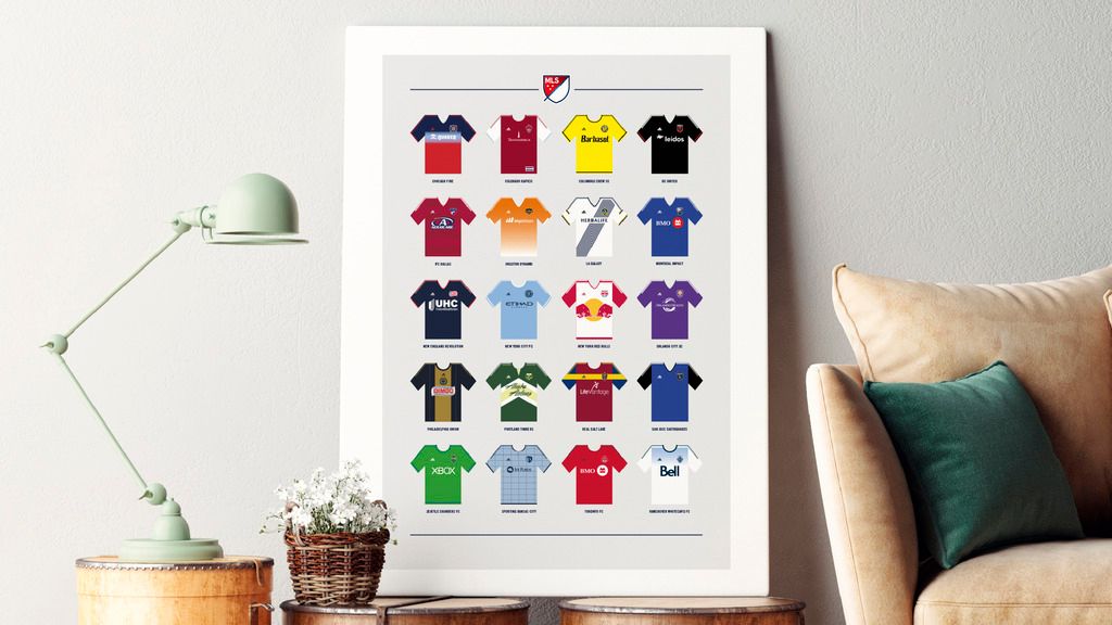
CHAS
BRAND IDENTITY REFRESH
PROGRAMS USED: ILLUSTRATOR, INDESIGN, PHOTOSHOP, POWERPOINT
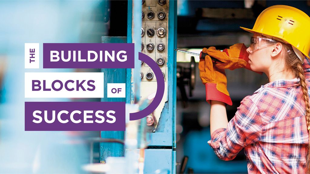
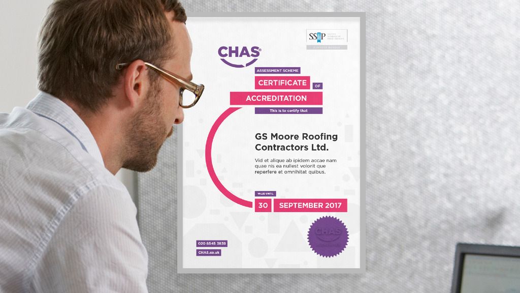
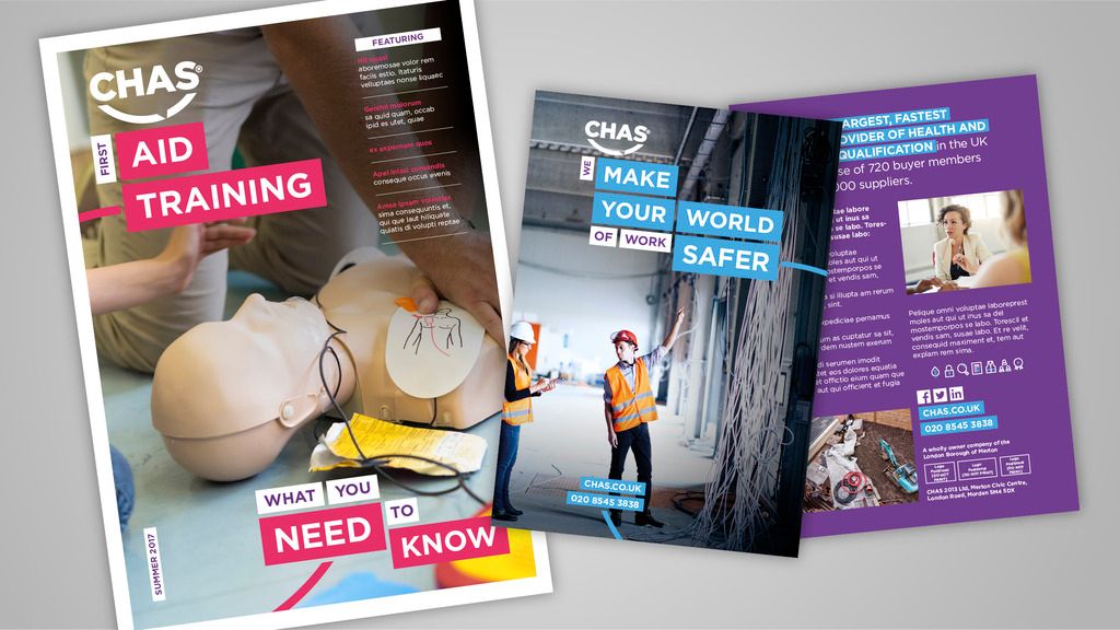
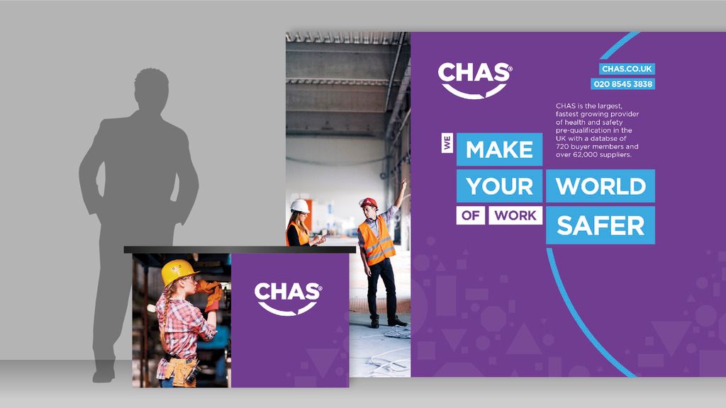
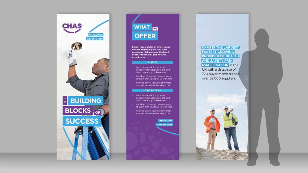
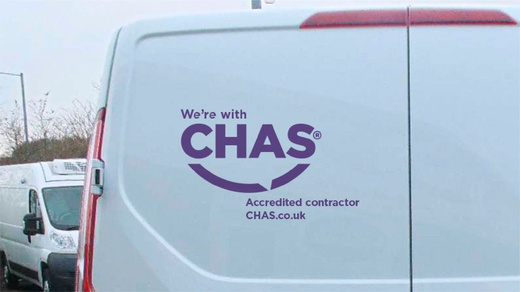
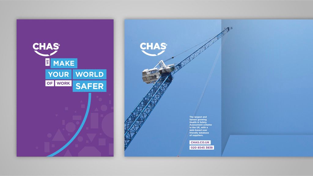
CHAS is a visible and credible leader in Health and Safety management, working to improve businesses, create business opportunities, drive industry standards and make the world of work safer. They wanted to provoke a re-appraisal of – what they do, how they do it and why, as well as to modernise their visual identity. The rebrand exercise was part of broadening the services to be offered and in line with the launch of a new digital platform. The logo was modernised, honouring the original and conveying the ideas of communication and connection, with the extended identity being built around this concept. Purple, a colour which they 'own' within the sector, was also to be a core feature of the refreshed identity, complimented with a bright yet simple secondary palette.
The extended identity expanded on this idea of connection and conversation with 'building blocks,' coloured blocks of type that lock together to create standout titles and moments of focus across communications. Icons were also constructed built around this refreshed identity to reflect the different sections on the new CHAS website and built around a consistent framework that would allow any created in future to clearly fit within the same family.


AKZONOBEL
ROUTEFINDER GAME
PROGRAMS USED: AFTER EFFECTS, ILLUSTRATOR, INDESIGN, PHOTOSHOP
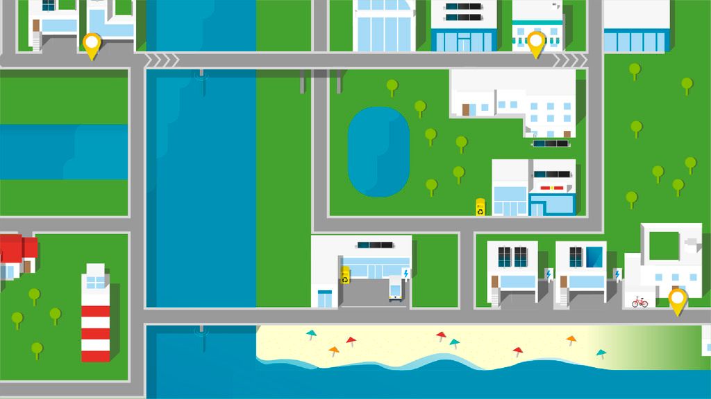
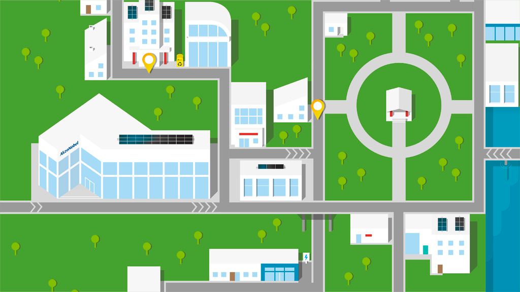
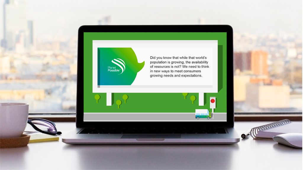
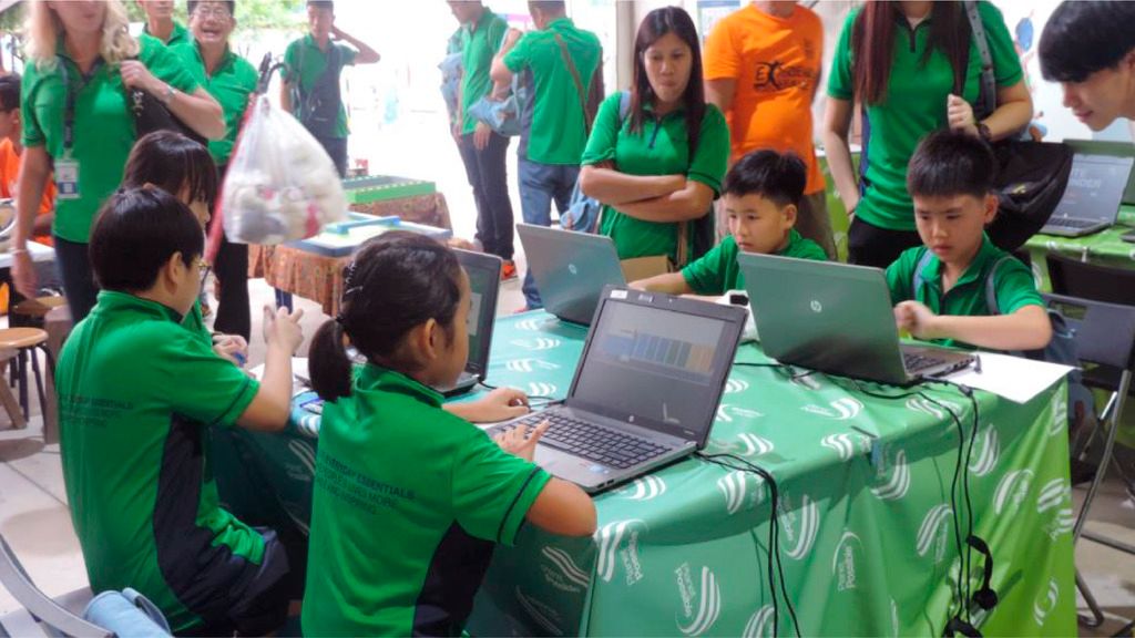
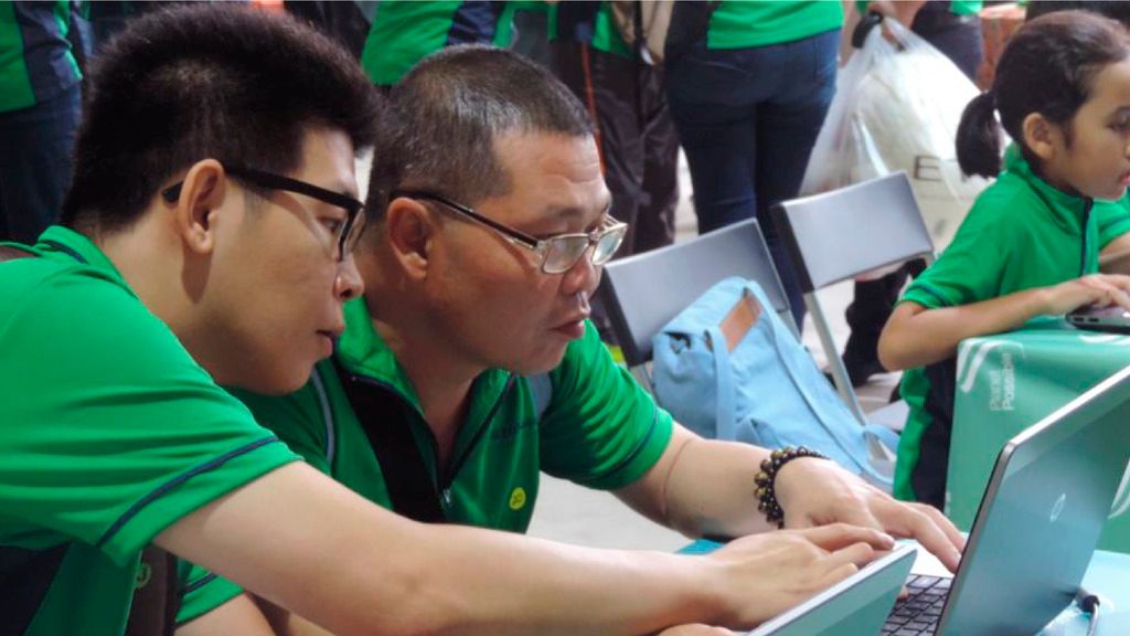
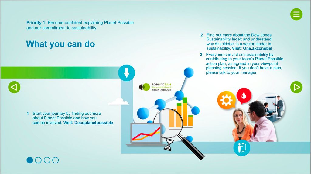
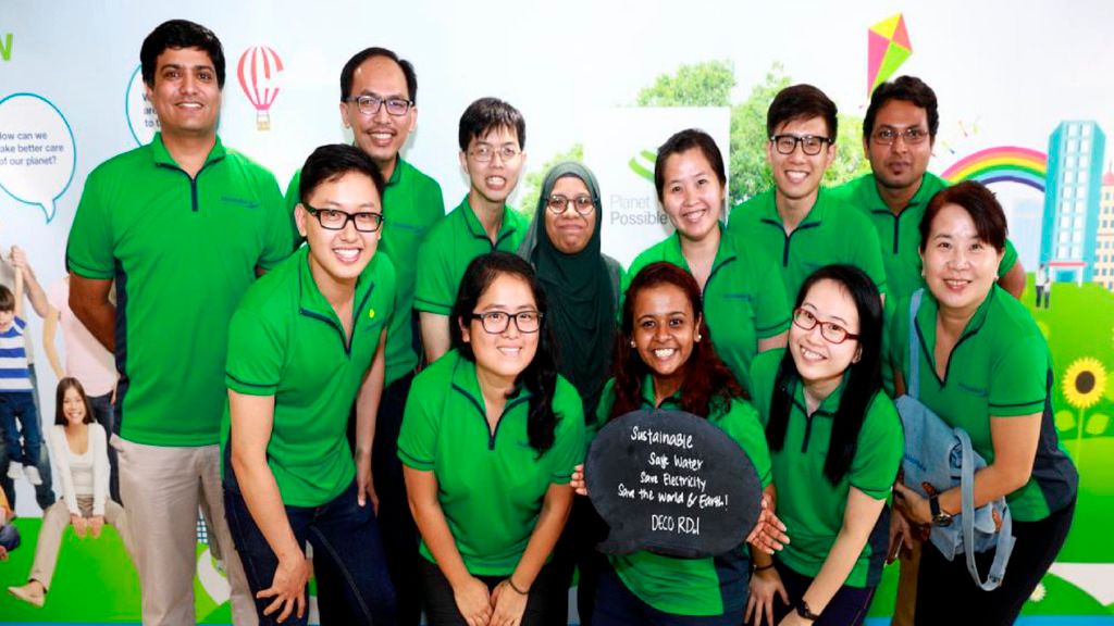
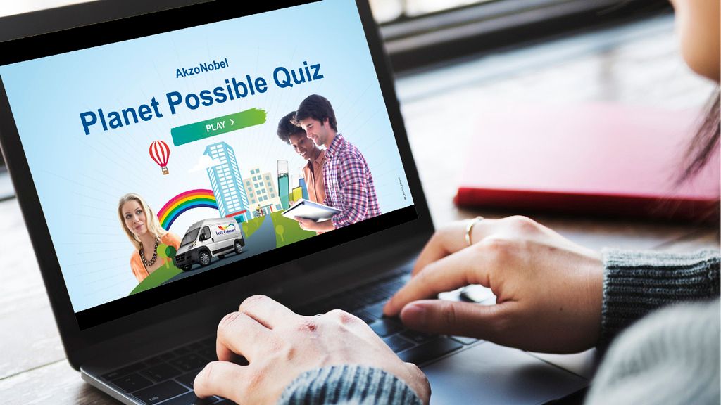
Planet Possible, AkzoNobel's sustainability arm were looking for a new and exciting way to engage its workforce around sustainability, using a light hearted mechanic to retain engagement within employees. This notion spawned the RouteFinder game, a game that subtly reinforces AkzoNobel's sustainability practices in a competitve and addictive framework, that feels distinct and unique from their other sustainability communications.
The concept of the game is simple, with the player tasked with delivering employees home after work in an electric bus. Completion of the level results in a score which is then uploaded to an online leaderboard, with everyone competing for 1st place. The game features four levels of increasing difficulty, challenging the players to memeorise levels and find quicker routes. There is also fellow road users to contend with as well!
The game debuted at an event in Singapore, being well recieved by those in attendence, as well as becoming a permanent feature on AkzoNobel's intranet.

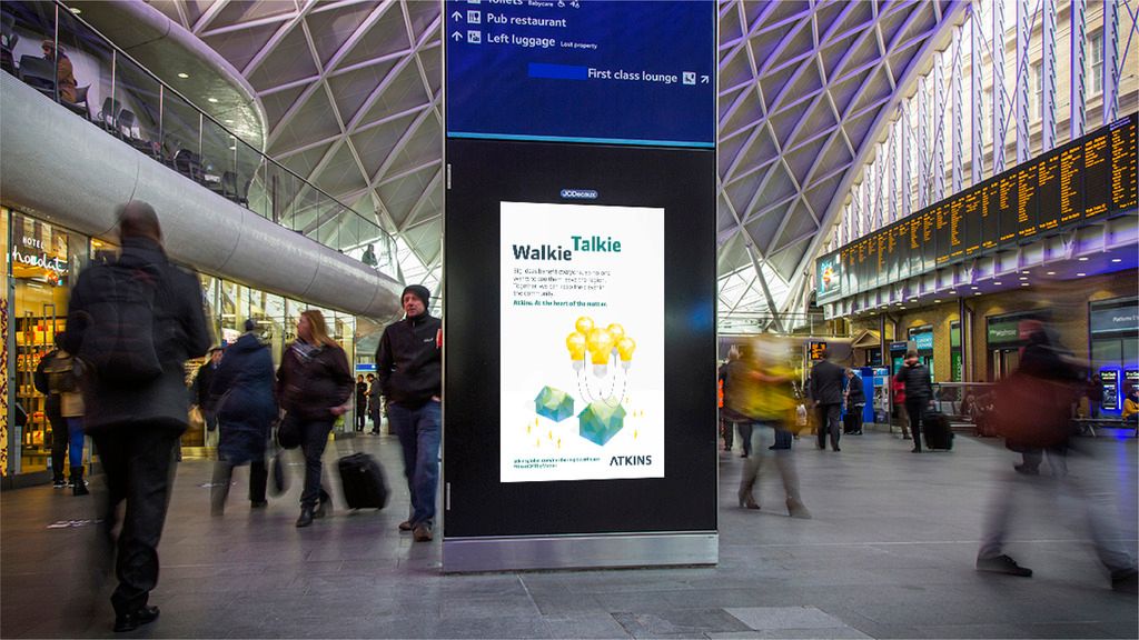
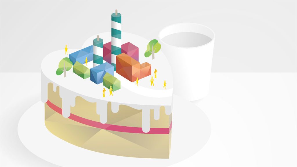
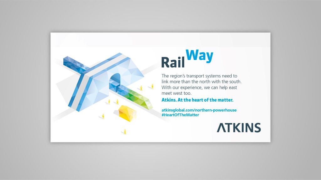
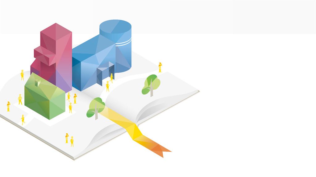
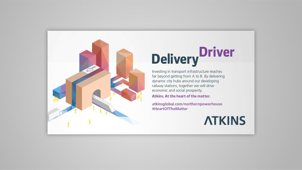

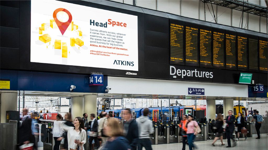
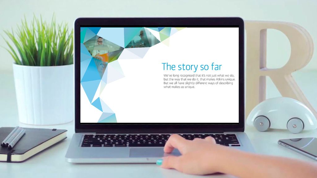
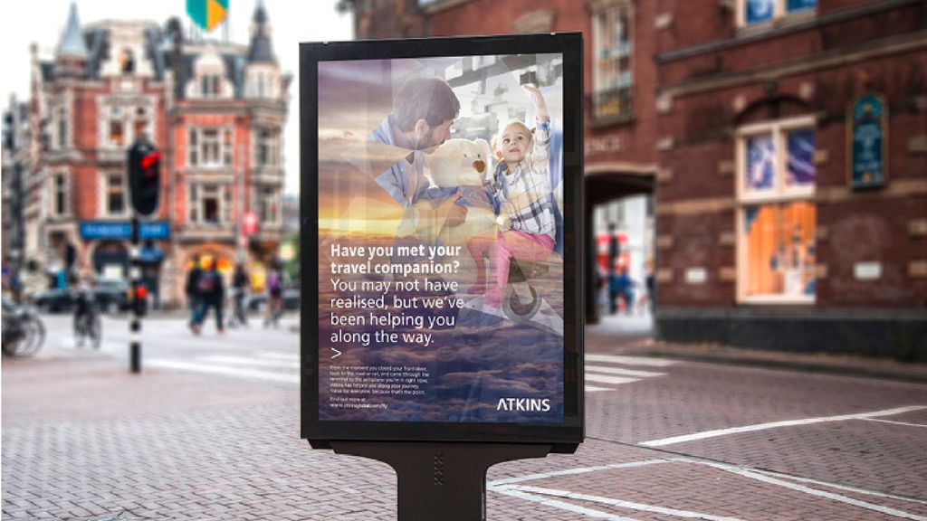
ATKINS
UK CAMPAIGNS
PROGRAMS USED: ILLUSTRATOR, INDESIGN, PHOTOSHOP
Atkins wanted to increase awareness of who they are, and what they are about. Displayed in a major transport hub (Manchester Piccadilly) as well as online, an illustration style was created using the previously established kaleidoscope shapes and applying them to isometric constructions, creating a unique and visually appealing look.

ABOUT
iainbudgen@googlemail.com
I am a multi-disciplinary graphic designer based in the South-East of England. With over four years of design experience in the heart of London, I have grown to love embracing challenge, diverse projects, technology and different mediums to create work which goes beyond client expectations. Coupled with a burning desire to win and succeed, I’m extremely driven to become a real asset to employers and clients alike.
When not working, I can normally be found watching football, at football, talking about football, watching another sport or seeking out the latest hiphop tune.
This portfolio highlights my work across a small number of projects. If you have any questions or a requirement I may be able assist with, feel free to contact me via my email.
EMPLOYMENT
APPETITE | January 2013 - March 2017
Thrown in at the deep end as a Junior Designer in a tightly knit team, I was given the opportunity to get involved with projects from conception to completion. Progressing through the ranks to become a Middleweight Designer, I now take a leadership role on projects from conception to delivery.

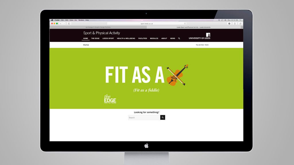
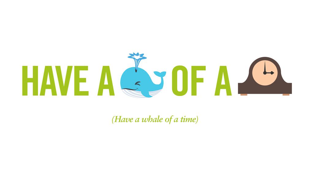
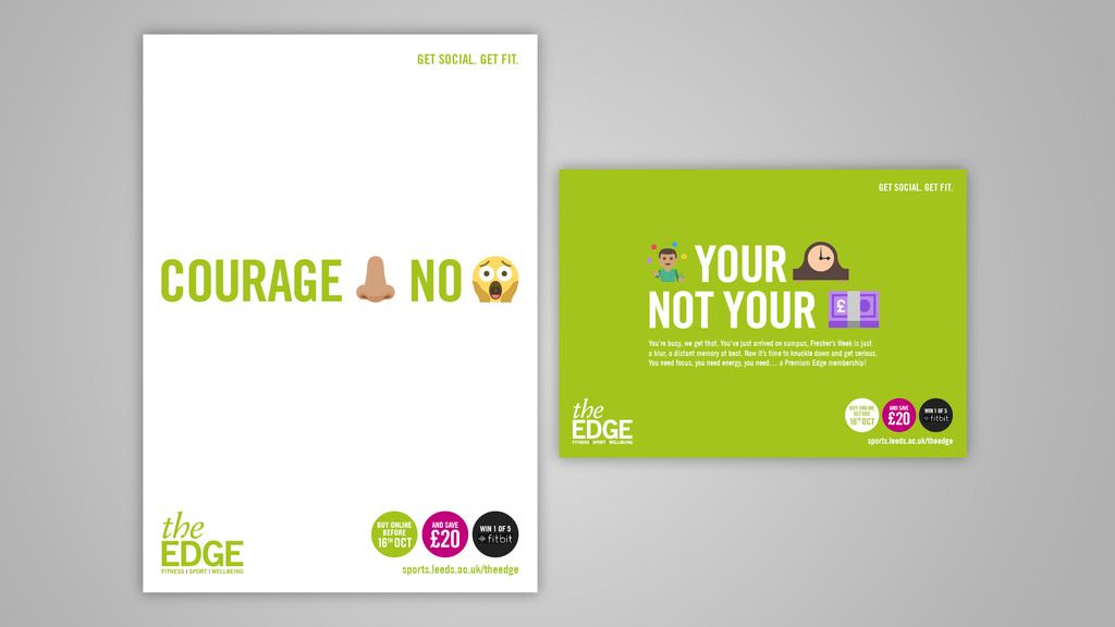
UNIVERSITY OF LEEDS
THE EDGE 'EMOJI CAMPAIGN'
PROGRAMS USED: ILLUSTRATOR, INDESIGN, PHOTOSHOP
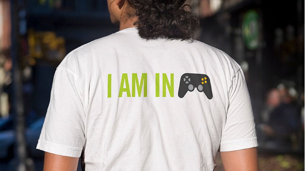
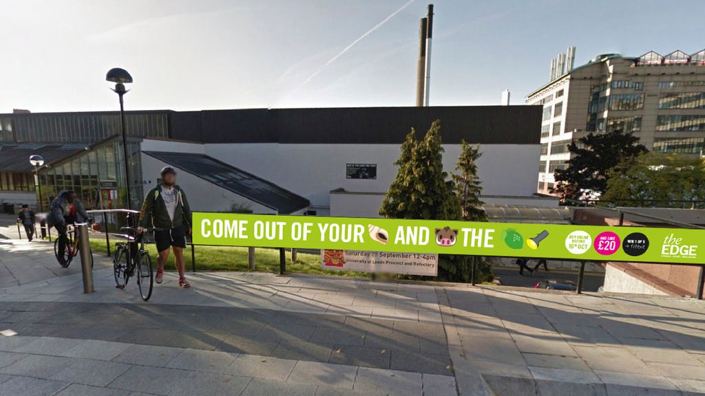
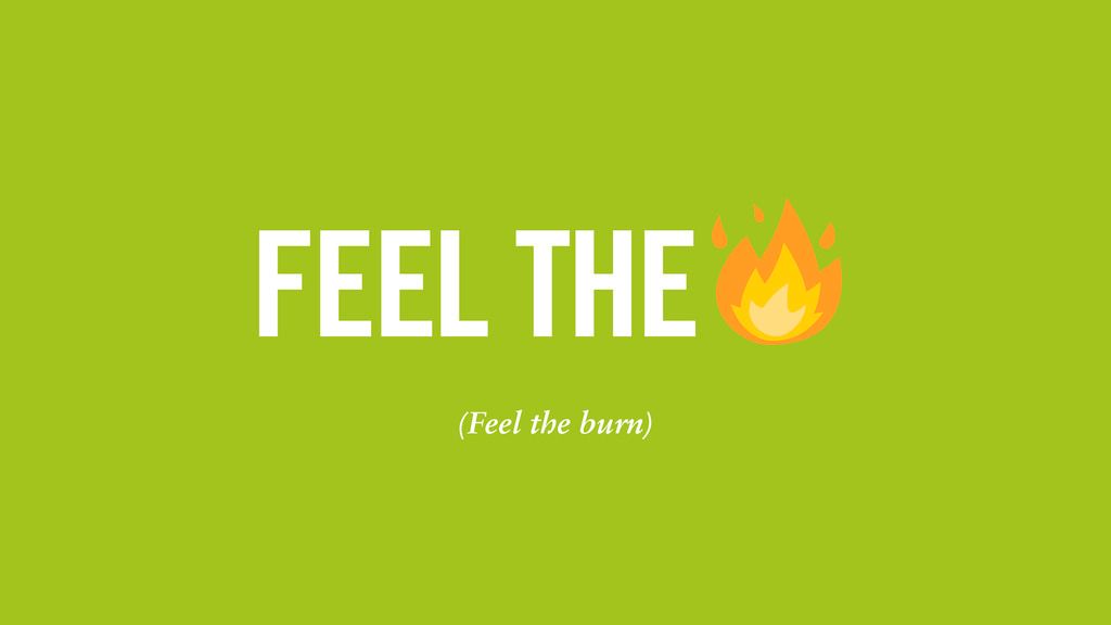
As the freshers start to arrive for their first year at university, the benefits of maintaining a healthy living can be a hard sell. The universities gym, The Edge, wanted take the opportunity to target these new potential customers by creating a disruptive campaign that used the language of the target audience. With this in mind, the campaign used emoji's to put across lighthearted phrases that (for the most part) were centred around exercise.
These messages were displayed all across campus as well as on their digital platforms, being well received by students and staff alike.

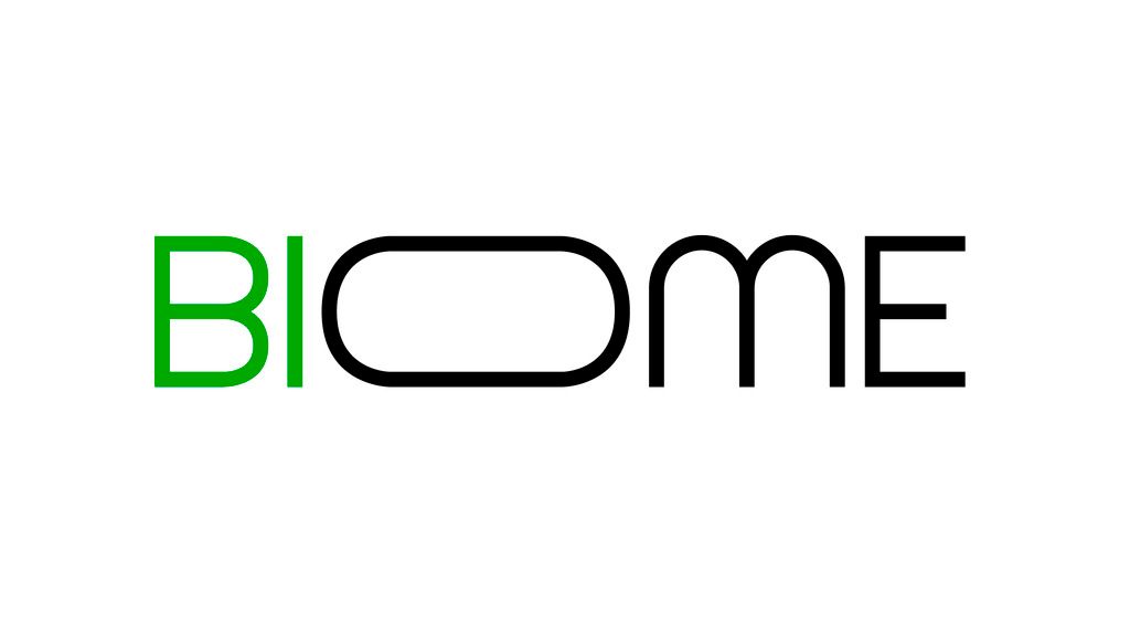
BIOME PRODUCTIONS
IDENTITY DESIGN
PROGRAMS USED: ILLUSTRATOR, INDESIGN, MUSE, PHOTOSHOP, POWERPOINT
Biome Productions is a young, driven and close knit production team based in Bristol, specialising in the application of VR technology to wildlife filmmakin in the heart of Bristol
They wanted a logo that felt different to the other production companies operating in a similar space, that felt modern and an accurate reflection of what the business is about.
This was shown in both the logo and in the brands core applications - the 'O' of Biome mimicking the shape a VR headset whilst in the key communications, wildlife are seen breaking through the flat 2D space, a nod to the capabilities of VR technology.


AKZONOBEL
PLANET POSSIBLE INTERNAL CAMPAIGNS
PROGRAMS USED: ILLUSTRATOR, INDESIGN, PHOTOSHOP, POWERPOINT, WORD
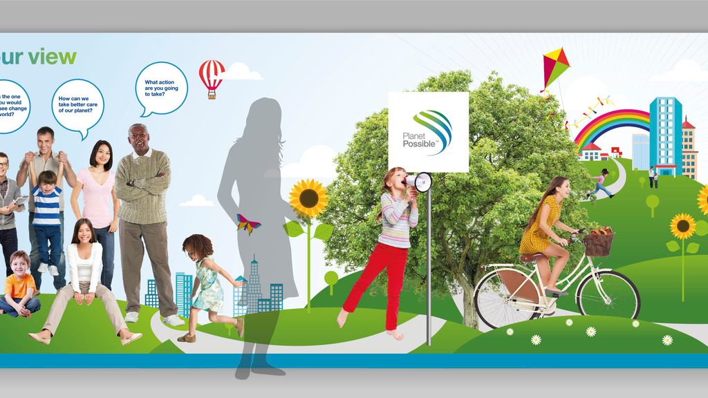
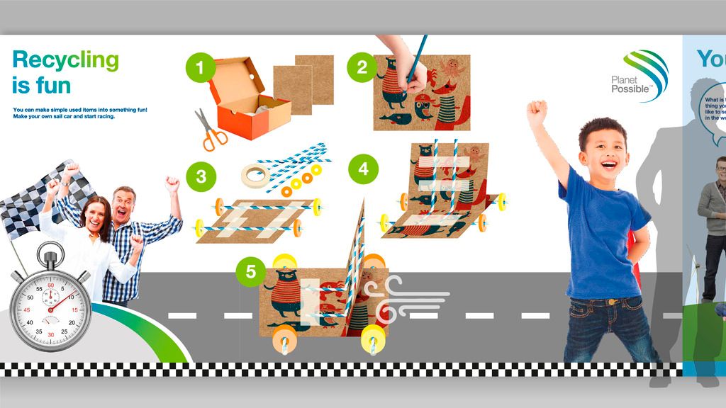
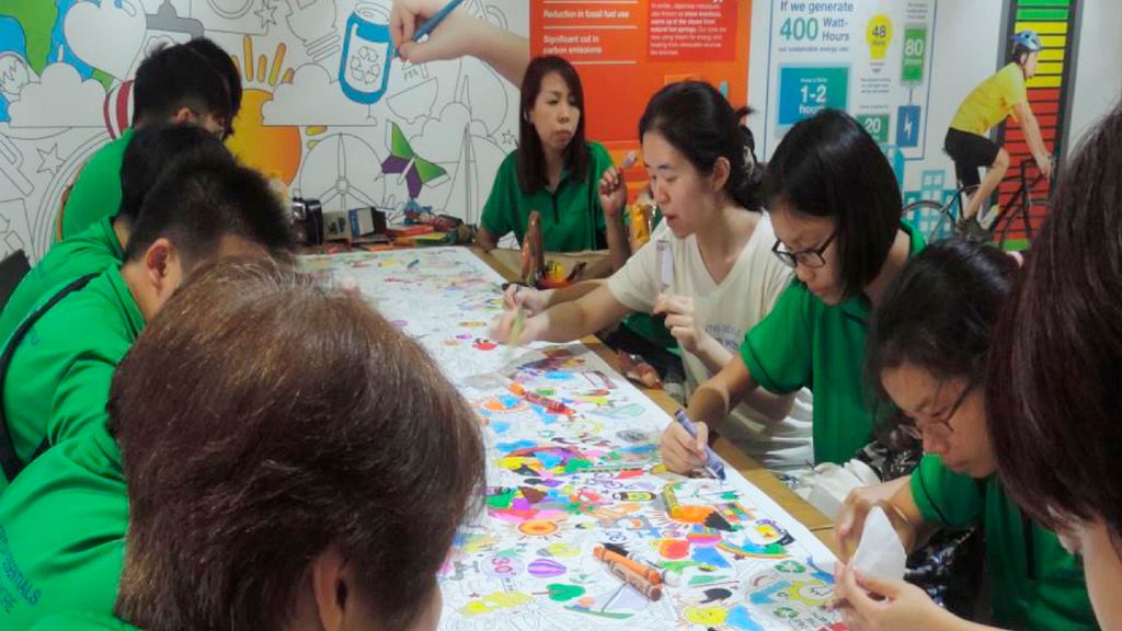
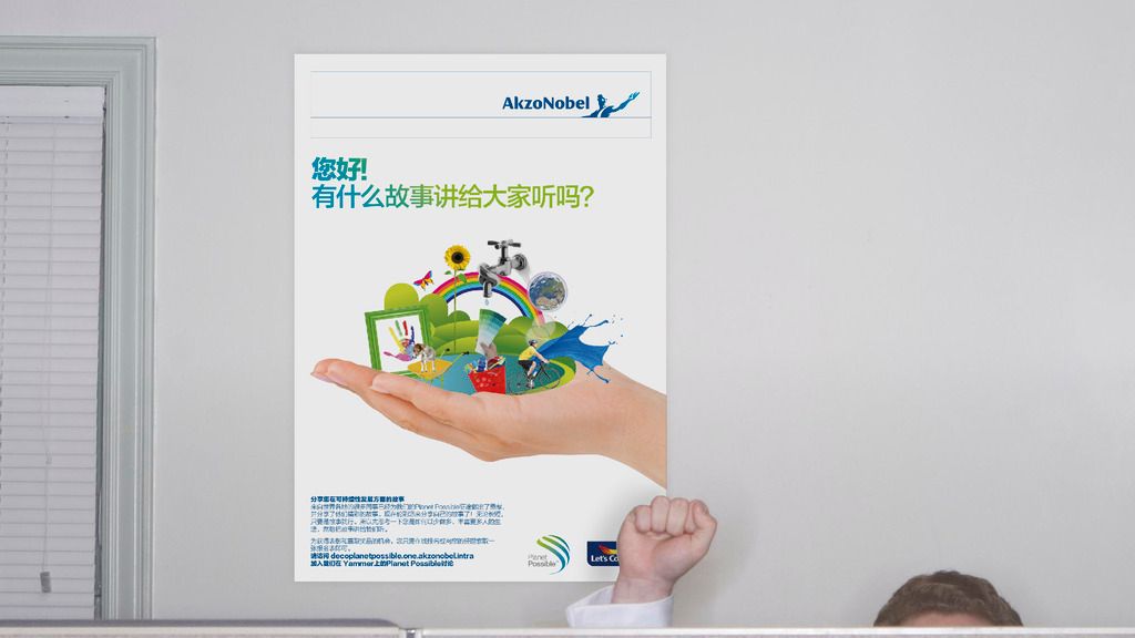
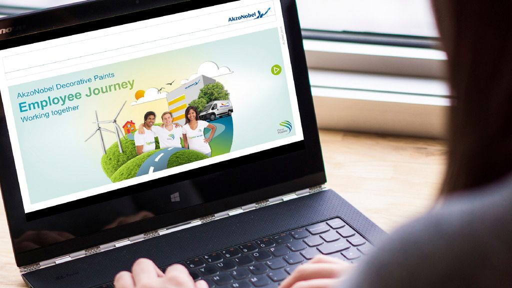
Planet Possible is the sustainability arm of AkzoNobel, raising awareness of advantages of sustainable products, as well as praising and bring to the forefront those that are doing sustainable work in either the company or in the wider world.
This work was stretched across a variety of different campaigns, each having a different theme, connected by a distinct look that felt separate from typical AkzoNobel communications, across a variety of mediums. This included a sustainability game (created in PowerPoint), and an large event that debuted in Singapore.

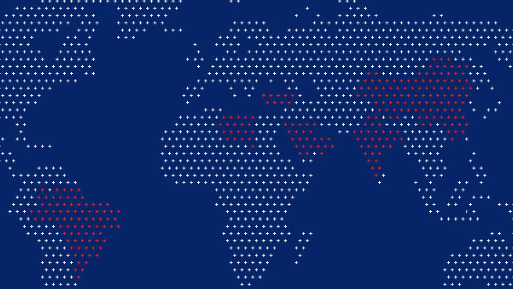
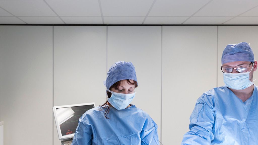
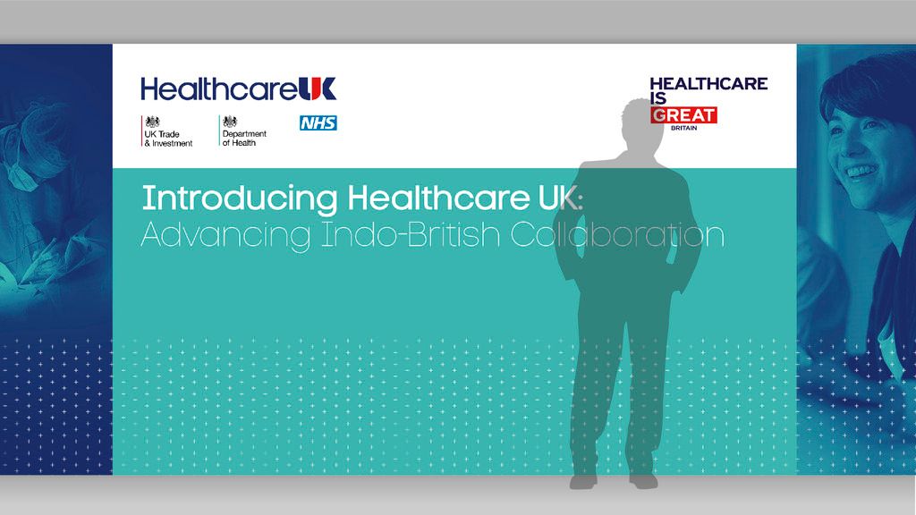
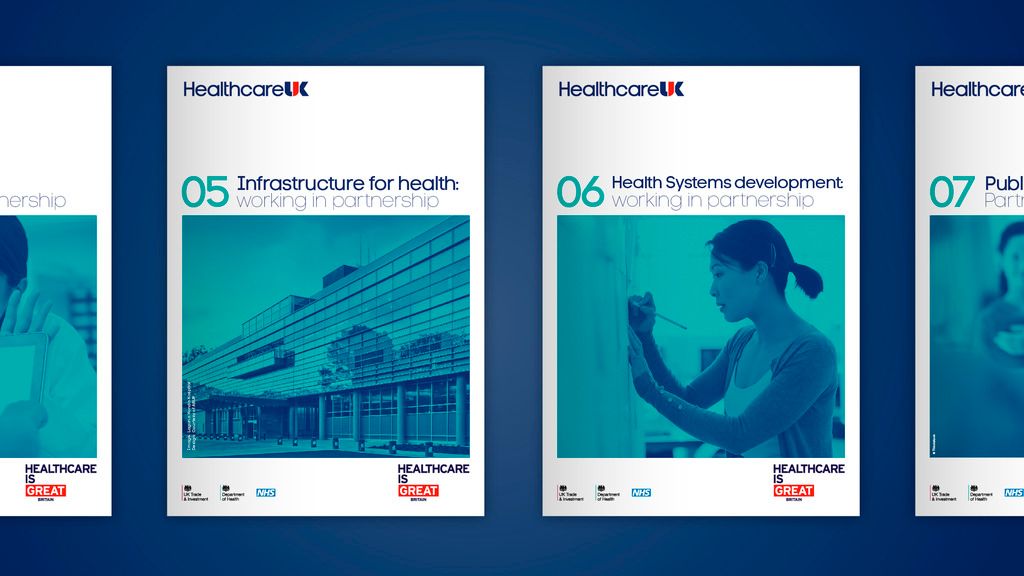
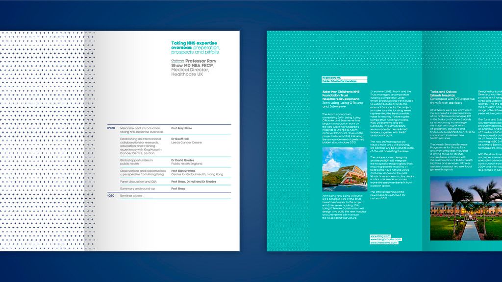
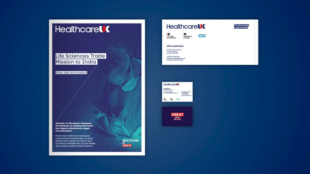

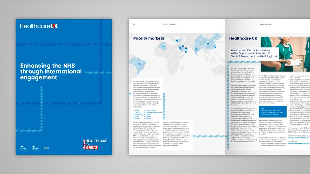
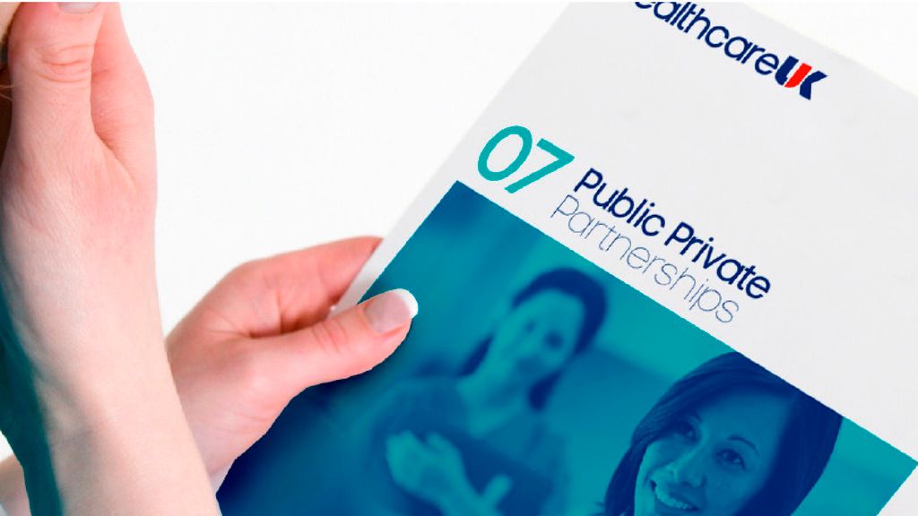
HEALTHCAREUK
BRAND IDENTITY
PROGRAMS USED: ILLUSTRATOR, INDESIGN, PHOTOSHOP, POWERPOINT, WORD
HealthcareUK is a joint venture between the Department of Heath, NHS England and UK Trade and Investments, promoting the best of the UK’s academic, public and commercial healthcare expertise to a global market. The challenge was to help HeatlhcareUK define its purpose, and develop a strong visual identity that conveyed the UK’s global leadership in this sector.
A brand identity was created and developed a communications framework that allowed us to raise the global profile of the organisation and deliver a clear and comprehensible vision to a multinational audience.
This resulted in over 600 UK healthcare providers being brought together and generating £550m of revenue from 22 major new contracts.

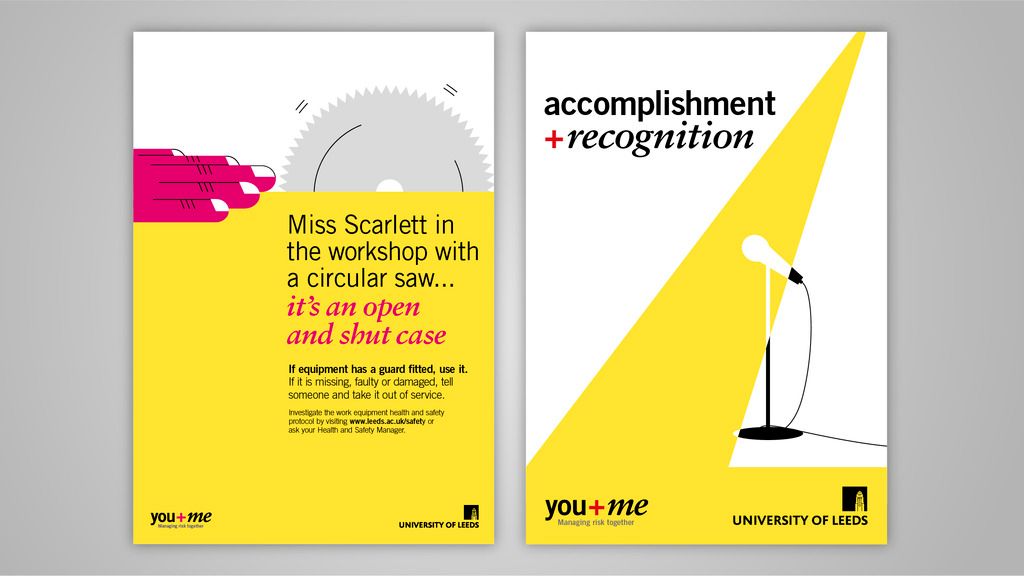
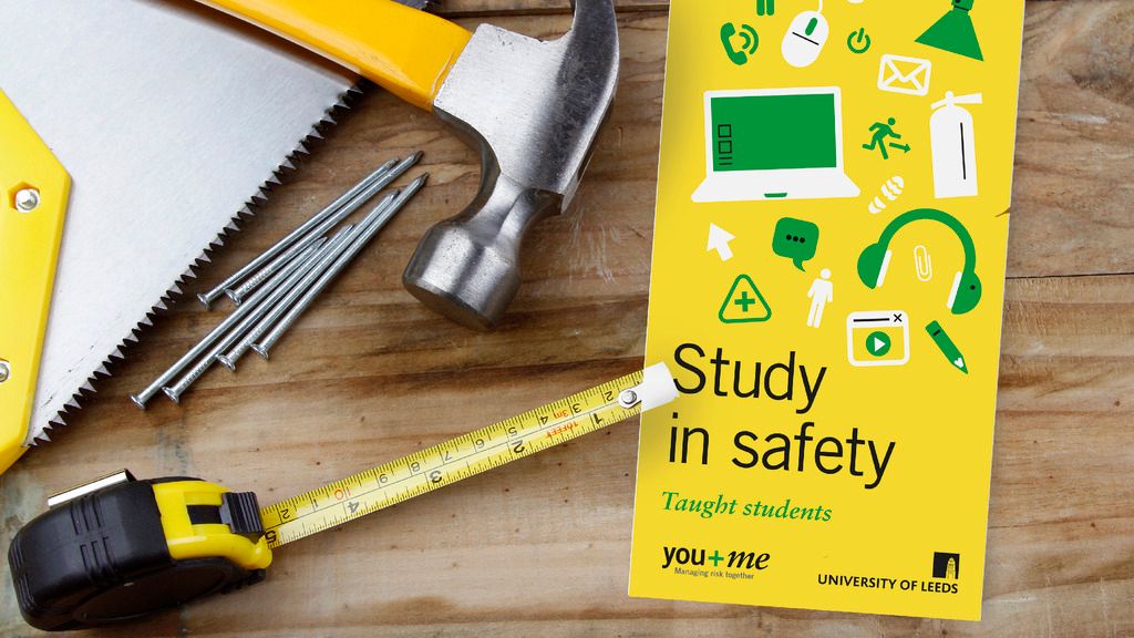
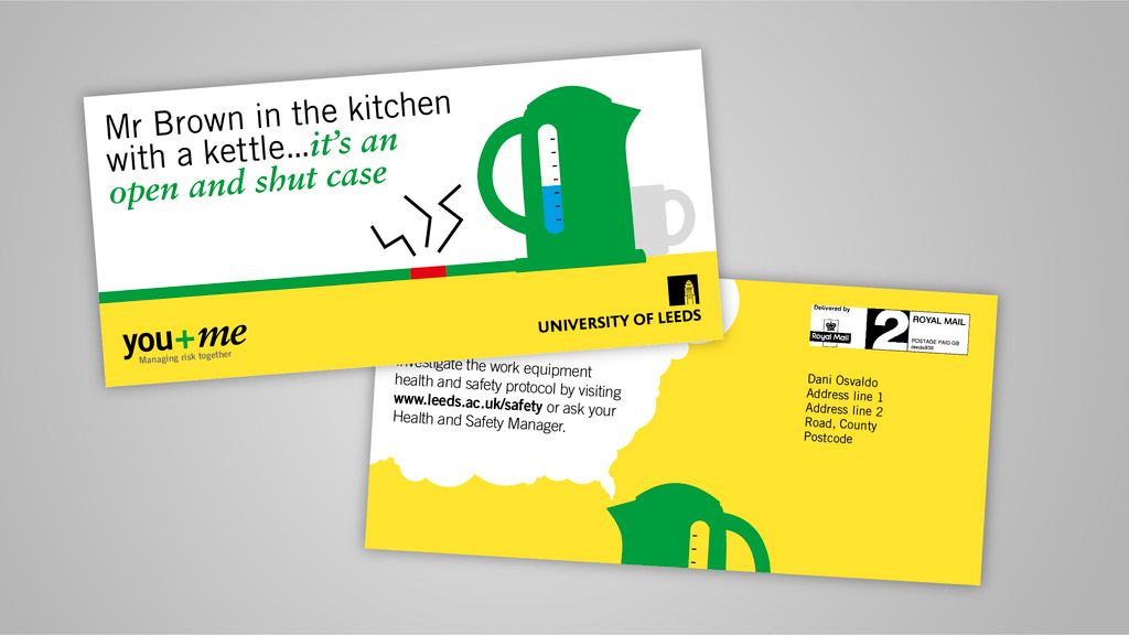
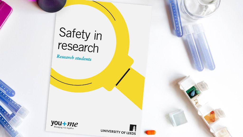
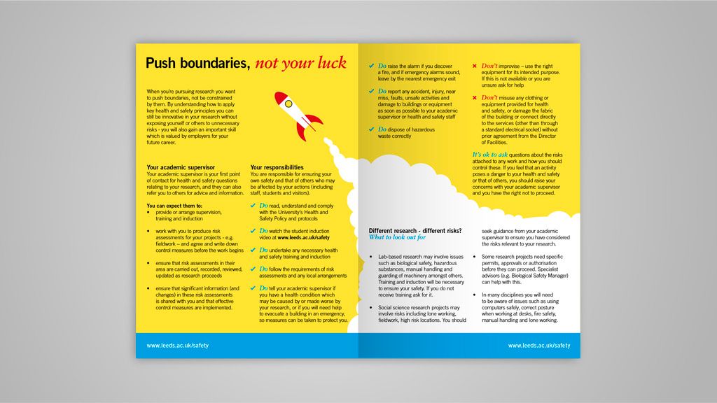


UNIVERSITY OF LEEDS
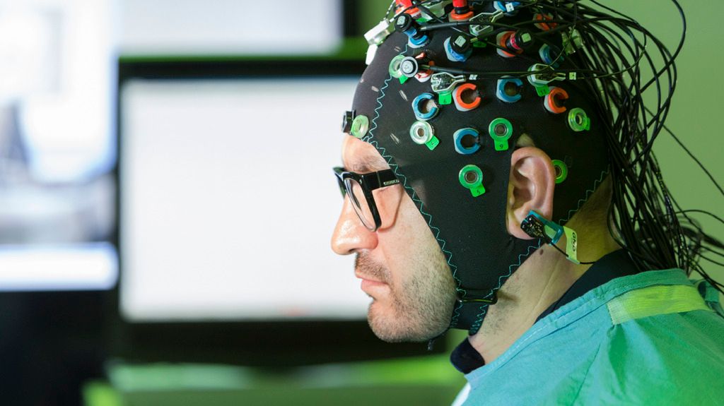
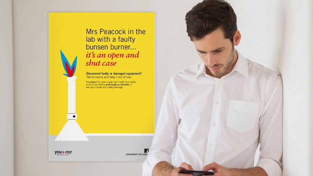
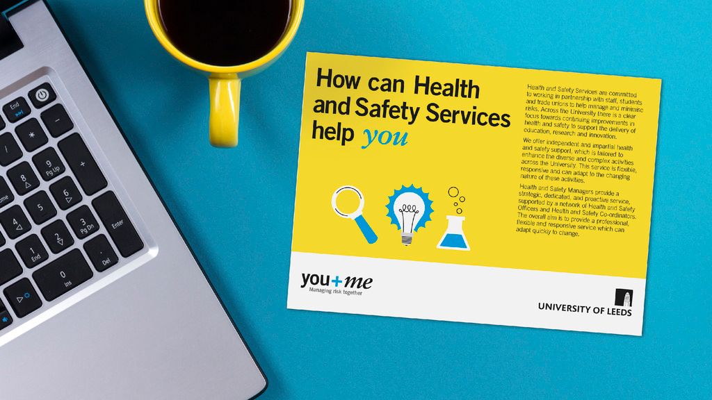
HEALTH & SAFETY BRAND REFRESH
PROGRAMS USED: ILLUSTRATOR, INDESIGN, PHOTOSHOP, POWERPOINT, WORD
Appetite had previously created an award winning identity for Health and Safety at University of Leeds (UoL) and after many successful years, UoL were looking to update the identity, keeping the visual and verbal language clear, encouraging and inspiring people to act early, and to work in partnership with Health and Safety. It aimed to project an open, considerate and human organisation that wants the best for the students and staff as well as the University, creating new ideas and an open dialogue for all involved.
Despite the switch in tone, it was important to retain the 'H&S Yellow' that was 'owned' by the health and safety department at the University. The graphical style was built around this, featuring the kind of stick figures that are seen in many health and safety signs. As well as this, secondary colours were introduced to create some variety within communications to keep the Health and Safety department relevant for years to come.

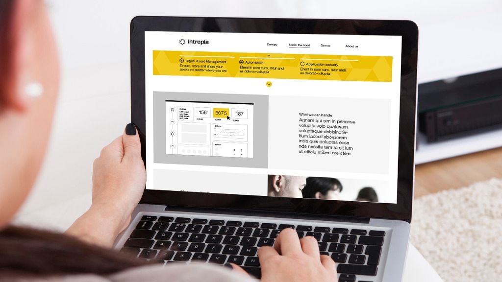
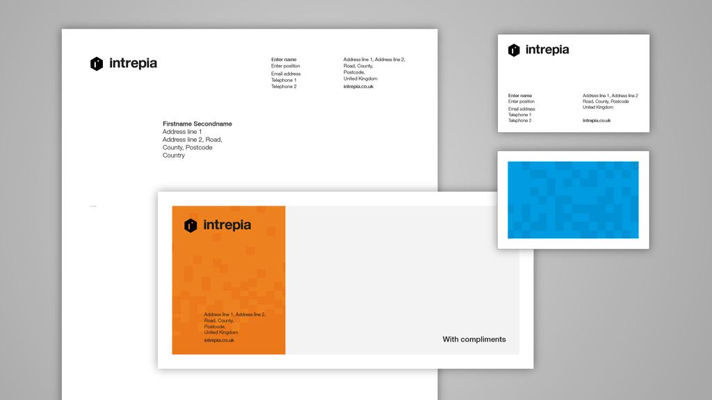

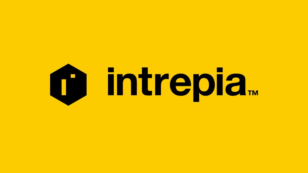
INTREPIA
BRAND IDENTITY
PROGRAMS USED: AFTER EFFECTS, ILLUSTRATOR, INDESIGN, PHOTOSHOP
Intrepia is a company creating brand and marketing management software that is great to look at as well as simple and effective to use, working with international clients in a variety of different sectors.
For a company that has a logo that has to live alongside clients logos on a regular basis, the logo has to be as plain, yet recognisable as possible, using a distinct symbol that could be used away from the logotype. The rest of the identity is also has stripped back as possible, with bold uses of colour as well as simple ‘smile-in-the-mind’ illustrations that simply convey core features and values of Intrepia’s products.

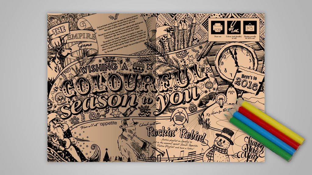
APPETITE CHRISTMAS
ANNUAL CHRISTMAS CARD
PROGRAMS USED: AFTER EFFECTS, AUDITION, ILLUSTRATOR, PHOTOSHOP, PREMIERE PRO
Every year the Appetite team gets together to pitch ideas for the Appetite Christmas card. Anyone can pitch in the team can pitch, and the winner is decided by group vote.
In 2015 I chalked up my first win (big moment!) with the trend of the time, adult colouring. Featuring festive graphics, messages and games ripe to be filled with crayon, it went down a treat with Appetite’s friends and clients. 2016 was a move into the digital age, capturing an essence of the time of year in a short film, featuring some images captured from our team as well some more humorous ones!

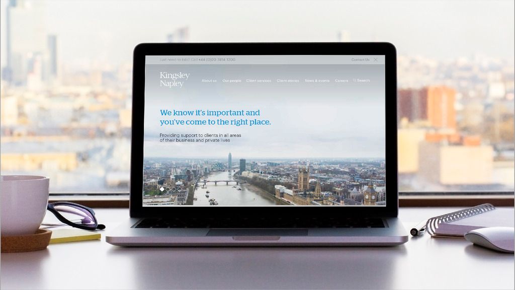
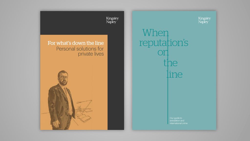

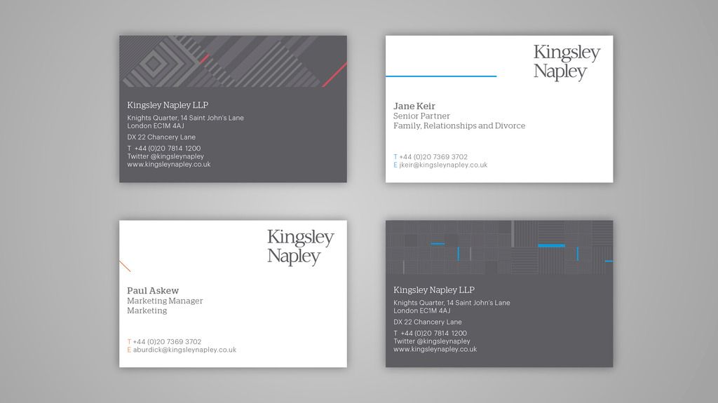
KINGSLEY NAPLEY
BRAND IDENTITY REFRESH
PROGRAMS USED: ILLUSTRATOR, INDESIGN, PHOTOSHOP, POWERPOINT
Kingsley Napley is a mid-size, multi-practice firm of solicitors based in London. Its wide range of expertise provides support for its clients in all areas of their business and private life. Kingsley Napley wanted a refresh that helped tell its story to a wider audience and stand out within a crowded marketplace.
This included all the usual applications of the brand, such as a new website and stationary, and was unveiled within the firm using an interactive PDF called 'Tailor made: Telling the story of our brand', that helped realign core values to its employees.


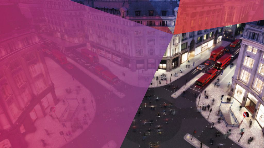
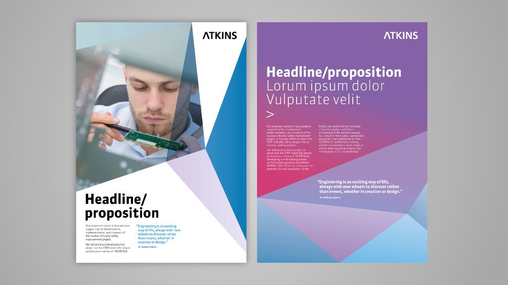
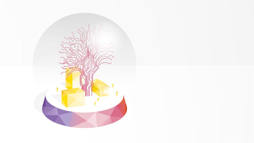
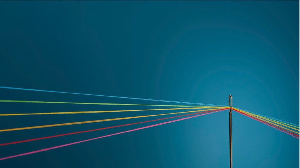
ATKINS
BRAND IDENTITY REFRESH
PROGRAMS USED: AFTER EFFECTS, ILLUSTRATOR, INDESIGN, PHOTOSHOP, POWERPOINT
Atkins is one of the world’s world's leading design, engineering and project management consultancies and wanted a refresh to their brand identity to identify an authentic look that would make them stand out within their sector.
Using their existing identity as a starting point, the shapes eventually evolved into a kaleidoscope of shards, able to evolve in shape, direction and colour as and where required. This included providing a kit of parts for the inhouse design team including ready made kaleidoscope forms and could be easily applied to designs or layouts. The idea was the despite the complexity of the kaleidoscope at face value, it is very simple to edit, tweak and create on the fly.
This was all wrapped up in a comprehensive brand guidelines, made available online for the inhouse team to access at anytime, anywhere.
